Designing security products at ServiceNow
Helping security teams prioritize and act on cyber threats faster.


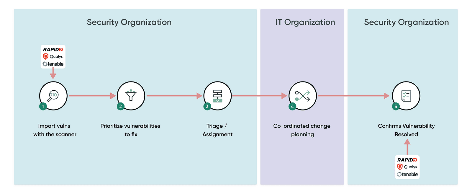
As part of the security products team at ServiceNow, I redesigned a vulnerability response dashboard to help security professionals make fast, confident decisions during a threat incident. The dashboard consolidated information from multiple scanning tools, allowing users to filter vulnerability based on the preference, prioritize what matters most, and take action without wasting time.
After redesign, we saw 65% jump in the product adoption.
1) Product Adoption:
Bigger companies with much more data to secure do not use existing VR as it didn’t meet their complex information security needs. The team was looking to improve the overall user experience of VR.
2) Existing UX:
Security teams are often overwhelmed by a flood of vulnerability data spread across various tools. There’s no central view to help them:
Understand how a vulnerability affects their systems
Know which threats to prioritize
Take timely action without confusion
“Security teams spend more time switching between systems than actually solving problems.”
MY ROLE
From reviewing prior research to supporting developers through launch, my design process for this project was not linear. I was more involved in the second diamond of the double diamond process, focusing on creating, testing, and refining designs as the research was done earlier.
As I worked on multiple overlapping projects, I continuously incorporated new insights to ensure my work stayed adaptive and aligned with evolving project needs.

Reviewed prior user research
ServiceNow is a complex product. To understand it better, I took two mandatory platform training and one LinkedIn course related to the Vulnerability Response application. While going through the training and courses,
I translated my learnings into Flows, Personas, and Information Architecture.
High level system flow
Understanding the current landscape
After defining the personas, I reviewed existing zoom calls with users and had multiple discussions with SMEs and using bottom up approach, I identified themes and presented to the team
What users were saying?
"If everything is critical, nothing is critical."
"I can't see what is important to me, too much noise on the existing dashboard."
"There is no point in giving them more when they can't fix what's assigned to them."
"If you throw a million vulns over the wall, nothing will be done."
"We are not trying to boil the ocean."
"We encourage working at the group level, but they still work at the VIT level."
"We are abandoning the use of Vuln groups altogether."

After identifying key pain points, carefully mapped to a specific design goal, guided by fundamental UX principles:
Design for personalistaion
Noise : Users struggled with overwhelming irrelevant vulnerability data.
Goal: Create personalised filter that highlight high-risk vulnerabilities and low-priority information, helping users focus on what truly matters.Design for effective grouping and workflow accuracy
Ineffective bundling: Vulnerabilities were scattered and not meaningfully grouped, causing slower issue handling.
Goal: Organize related vulnerabilities into logical bundles and groups.Assignment inaccuracy: Vulnerabilities were frequently assigned incorrectly, causing delays and confusion.
Goal: Implement smart automation and validation to ensure vulnerabilities are routed to the right teams or individuals.Design for personalization
Low product adoption: Complex interfaces and limited customization led to low product adoption.
Goal: Offer personaliesd and adaptable workflows tailored to individual security team needs.Design to reduce cognitive load
Poor user experience: Users experienced steep learning curves and inefficient navigation.
Goal: Simplify the interface and streamline workflows for intuitive, efficient use by diverse roles.
The challenge:
Existing platform filters were generic and didn’t meet personalized security needs, leaving users overwhelmed by irrelevant vulnerability data.
Strategy:
Introduce 'Watch Topics' a personalized filtering and bundling feature designed to reduce noise and help vulnerability managers focus on what matters most.
This directly supports our design goal: 'Design for personalisation', ensuring users can zero in on high-risk vulnerabilities without distraction.
How watch topics work:
Define watch topics:
Users create custom 'Watch Topics' based on specific risk factors like high risk scores, critical CVEs, or overdue tasks to precisely track relevant vulnerabilities.Watch topic dashboard:
The dashboard contains high level information of vulnerabilities assets and CIsStrategic remediation & assignment:
Watch Topics enable grouping of related vulnerabilities, making it easier to assign and manage remediation tasks.
Key design considerations:
Easy access and visibility of Watch Topics within the workbench
Permission controls to govern who can view or modify Watch Topics
Ability to add vulnerabilities to existing remediation efforts
Intuitive visualization for quick understanding of focus areas on Watch topic dashboards.


The challenge:
Related vulnerabilities were not grouped in a way that reflected real-world remediation workflows, forcing teams to work issue-by-issue.
Strategy:
Security Analysts now have a visual workbench to create projects for IT Remediation Owners, making this grouping more actionable.
Key design considerations:
1) Security Analysts now have a visual workbench 'Watch topic' to create projects for IT Remediation Owners, making this grouping more actionable.
2) Work with tech to smartly assign remediation tasks.

I led design crits with product managers and developers to review ideas and align the team on VR’s new directioN. These weekly design reviews and crit sessions proved invaluable to make my designs well-rounded from all perspectives (desirability, feasibility, and business viability) while also getting a go-ahead from everyone in the team.
Feedback on designs:
Some of the feedback from the team:
1. Love the idea of 'Watch topics', it would be difficult for the user to edit.
2. Showing both dashboard and watch topic in the same list will take too much time to implement but we see value.
3. Fields on the form needs to polish a bit

I worked with the developers to address feasibility issues and edge cases I missed during the iterative phase.
I oversaw the design and development of the new VR workflows, and an all-new visualisation approach. I also designed features for patch orchestration
While everyone signed off on the high-fi mocks for the designs, there were feasibility issues and edge cases that came up once the developers began to build them. Along with addressing these, I also answered questions and talked through my designs regularly.For instance, missing filter interactions
From coordinating with multiple stakeholders to defending my designs and taking accountability for my mistakes, my this stint as a user experience designer taught me many critical skills required to excel in the industry as a designer.
I had the unique opportunity to work on the redesign of a product from scratch. I had the chance to see how products are built from the ground up, the constraints I have to work with, and how I can positively influence change.
I learned how to advocate for my design in large organisational structures.
Working on projects with existing research and constraints also made me adept at making the most of the resources I have available.
I became great at explaining ideas at the correct level of complexity and abstraction and improved my overall communication skills.
Collaborating closely with the PMs and Product folks at ServiceNow allowed us to take a research data-driven approach to some design decisions.
I also learnt a lot about how a design system works in a large organisation such as ServiceNow, using Figma components.

We saw 65% jump in the product adoption. Companies like Wellstar, SAS, Prime, Accenture now using ServiceNow VR app.
Thanks for stopping by! I'd ♡ to chat with you :)